Plinth CRM
A sales CRM built on a token-based design system: one set of colours, type, spacing and components across every screen.
A client CRM shown under a different name; client and contact data are blurred.
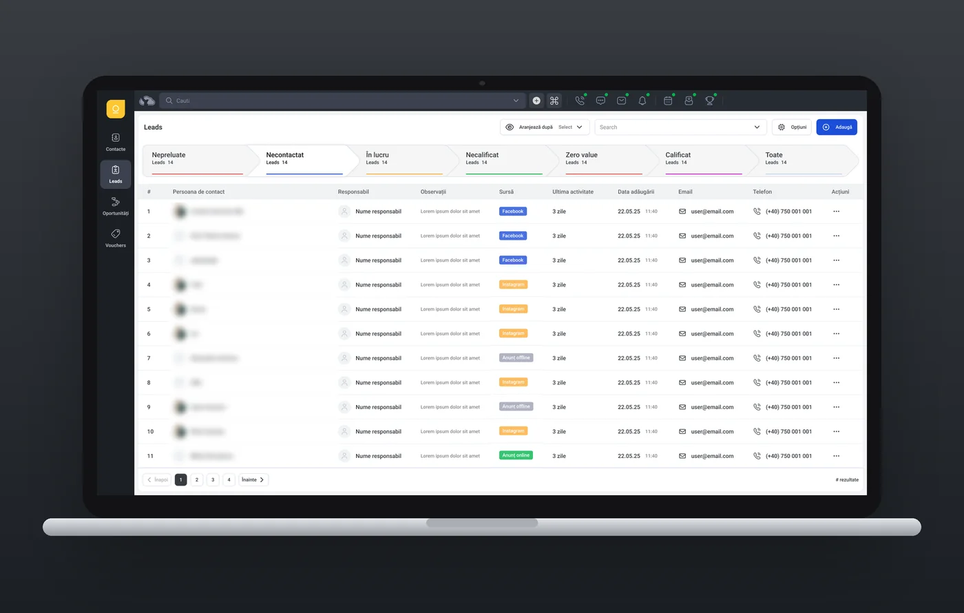
- Role
- UI/UX Designer
- Platform
- Web
- Software
- Figma
- Design system
- Figma variables for colour, spacing and type; shared components for buttons, tabs, pipeline steps, table cells, filters and menus
- Expertise
- UI/UX designDesign systems
Try the prototype
A CRM for car dealerships, built from the Figma board. Filter and sort 358 contacts, open a profile to replay a recorded call, move leads through the sales pipeline, and open an opportunity to see the vehicle file.
The left rail switches between contacts, leads, opportunities and vouchers. The top bar opens calls, messages, notifications, the app launcher and a ⌘K command menu.
Best on a laptop or desktop screen.
The problem
The CRM sits in a suite of business apps and covers leads, opportunities and contacts for sales teams. Every list, pipeline and record had to look and behave the same, and stay that way as more screens were added.
Features
- ·A documented colour system: six base colours in 10% steps, plus component, side-menu and top-menu colours
- ·Roboto type scale: headings H1 to H5, paragraphs and text links, each in medium, bold and regular
- ·Spacing scale from 2 to 24 px
- ·Buttons: normal, accent, compound, action and upload buttons with their states
- ·Tags in five tones, solid or light; tables built from 34 cell types and header components
- ·Navigation components: top and side menus, filter bar, breadcrumbs, tabs and pagination
- ·Date picker with quick ranges and a time range, a month calendar and a scheduling calendar table
- ·Simple and advanced dialog windows; advanced inputs with compound fields, switches and colour select
Approach
- 01
Foundations
ProblemA CRM full of dense tables and statuses easily drifts into one-off colours and sizes.
SolutionSet up Figma variables first: colours grouped by role (side menu, top menu, alerts, links, borders, backgrounds), a spacing scale from 2 to 24 px, and a Roboto type scale for headings, body and small text.
- 02
Components
ProblemEvery screen repeats the same controls: actions, tabs, filters, pagination, table rows.
SolutionBuilt the component library page by page: buttons, input fields, tags, avatars and tables (34 cell types and header components), then the complex pieces: a date picker with quick ranges and time ranges, calendars for scheduling, dialog windows, a filter bar and compound input fields, all reading from the variables.
- 03
Pipeline
ProblemA plain list of leads doesn't show where the sales work stands.
SolutionLeads and opportunities open on a row of chevron steps, each with its stage name, a count and its own colour. The active step turns white and filters the table below.
- 04
Status at a glance
ProblemPeople scan the tables for where each lead came from.
SolutionSource badges for Facebook, Instagram and online or offline ads reuse the link and alert colours at 80%, so one palette covers every status.
- 05
Navigation set
ProblemEvery screen shares the same frame around its content.
SolutionThe top menu bar, side menu bar, filter bar, breadcrumbs, tabs and pagination are components of their own, so lists, pipelines and records all sit in the same frame.


Design library
- Slate 100#383B41Text, active buttons and tabs
- LightGray 100#8E92A7Secondary text, muted tags
- Blue 100#1D4ED8Primary action, links
- Red 100#E45353Errors, critical states
- Yellow 100#FDAC3AWarnings
- Green 100#03B54ESuccess, positive states
- Component border#D9DCEBButtons, inputs, cards
- Page border#E6E8F3Page and panel edges
- Side menu background#1B1F24Side menu
- Menu highlight#3B414EActive menu item
- Top menu background#272C33Top menu bar
- Top menu icons#7F91A9Top menu icons
- H1 · Bold · 17/700Leads
- H3 · Bold · 14/700Persoana de contact
- Body · Medium · 14/500Necontactat
- Body · Regular · 14/400Nume responsabil
- Small · Medium · 12/500Adaugă
- Small · Bold · 12/700Leads 14
Sort button
Sorts a list: an icon, a label and the current choice. Hover greys it; once a sort is applied it turns slate.
- Container
- Icon
- Label
- Current choice
- Chevron
Large tab
Switches the sections of a record: activity, contacts, billing, addresses, documents.
- Tab group
- Tab
- Icon
- Label
Pipeline step
One stage of the lead or opportunity pipeline: its name, a count and its colour. The active step turns white and filters the table.
- Chevron
- Stage name
- Count
- Stage colour
Tag
Labels in tables and records: lead source, status, score. Five tones, each solid for strong signals or light for quieter ones.
- Tag
- Label