Designing a crypto treasure-hunt app: Glimpse
A treasure hunt for the modern world: drops of crypto and prizes hidden around the city. How the fintech mobile app was designed, phase by phase.
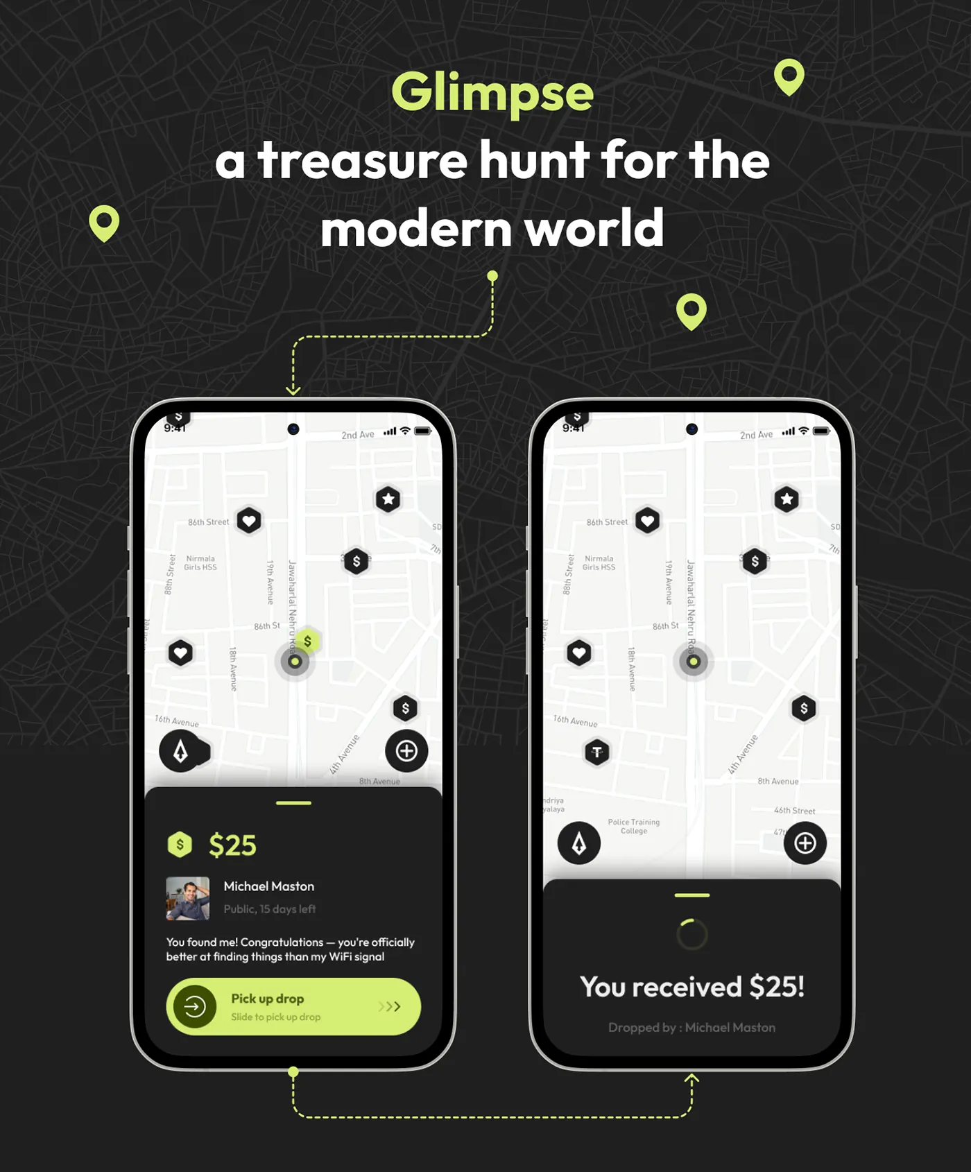
A treasure hunt for the modern world: drops of crypto and prizes hidden around the city.
Project at a glance
- Product: Glimpse, a fintech mobile app
- Platform: Mobile app and web admin
- Software: Figma
- Design system: Light map screens with dark bottom sheets, lime accents, custom icons and feedback animations
The challenge
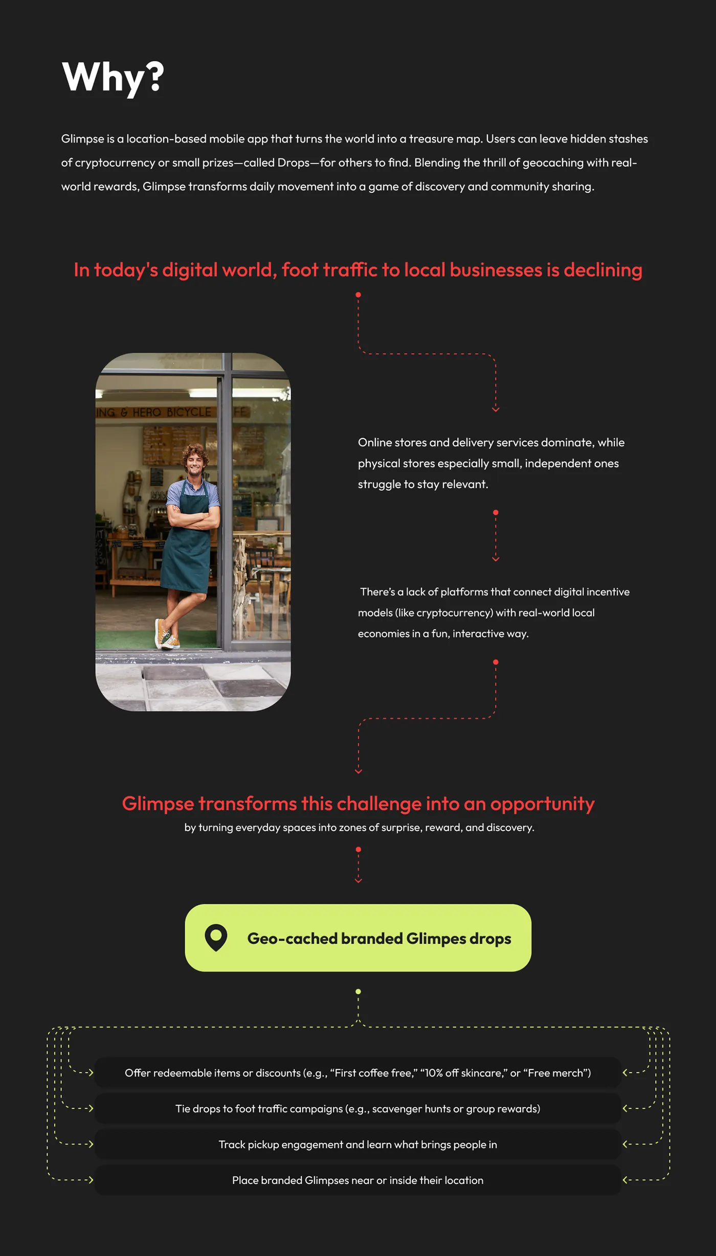
Foot traffic to local businesses is declining as online stores and delivery take over, and nothing connects digital incentives like cryptocurrency with real-world local economies in a fun way.
The UX approach
The work moved through 6 phases: discovery, audiences, wireframes, drop mechanics, business admin and testing.
1. Discovery
The problem. Small shops were losing foot traffic to online stores, and no product tied crypto incentives to local streets in a playful way.
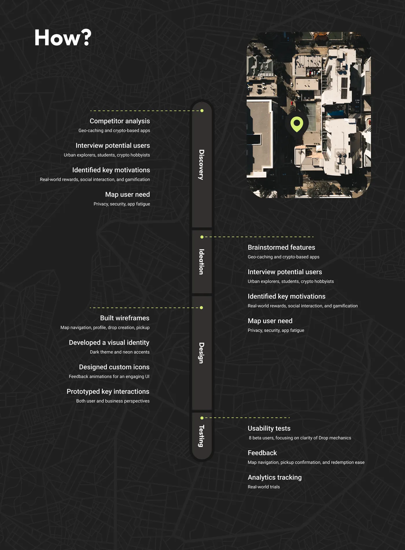
The solution. Reviewed geocaching and crypto apps and interviewed urban explorers, students and crypto hobbyists. Real-world rewards, social play and gamification came up as motivations, with privacy, security and app fatigue as concerns.
2. Audiences
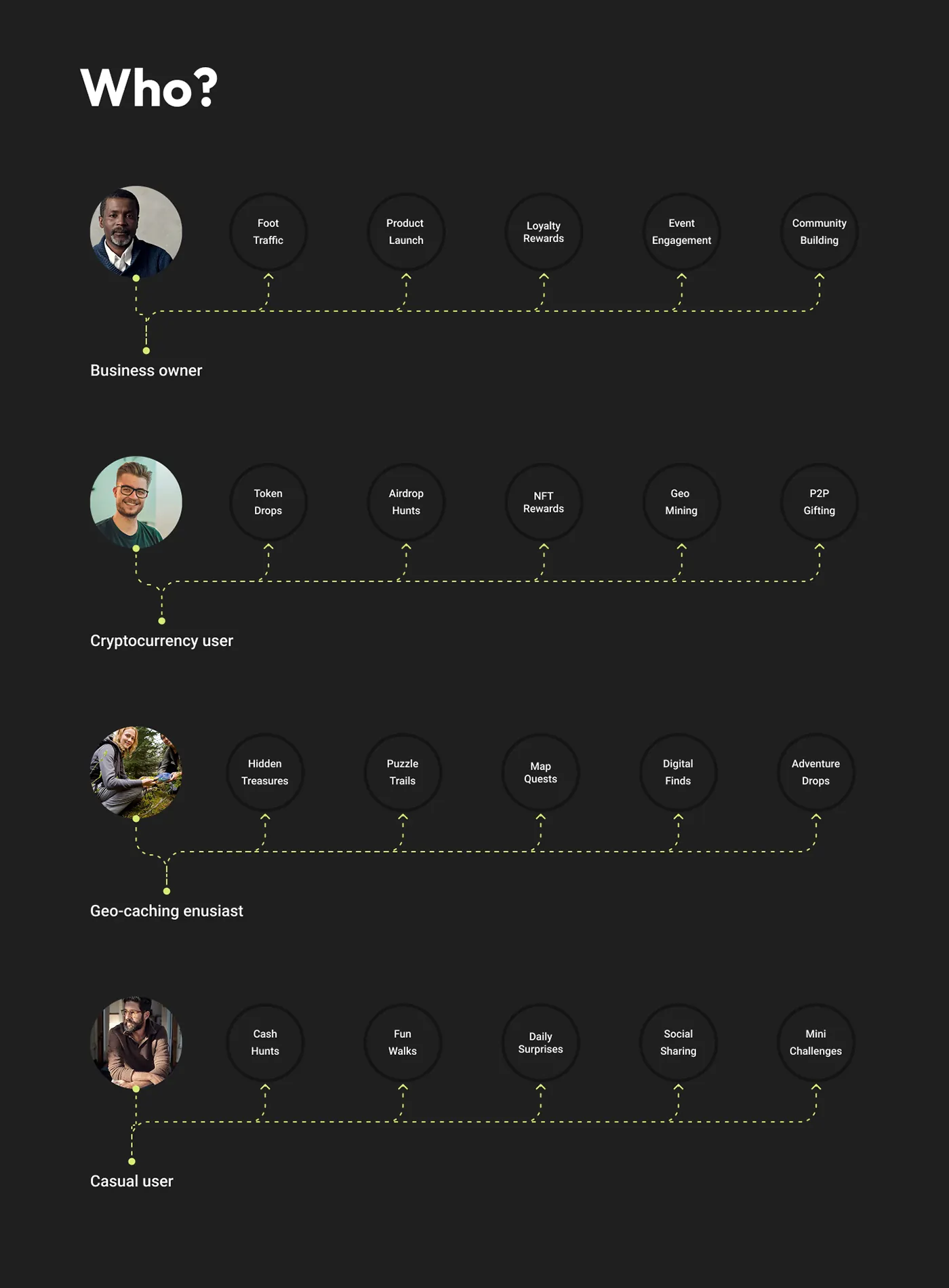
The problem. Four groups wanted different things: business owners wanted foot traffic, crypto users wanted token drops, geocachers wanted trails, casual users wanted small surprises.
The solution. Built the product around one shared object, the Drop. Money, tokens, hearts, flowers and stars all use the same mechanic, so each group finds its own reason to play.
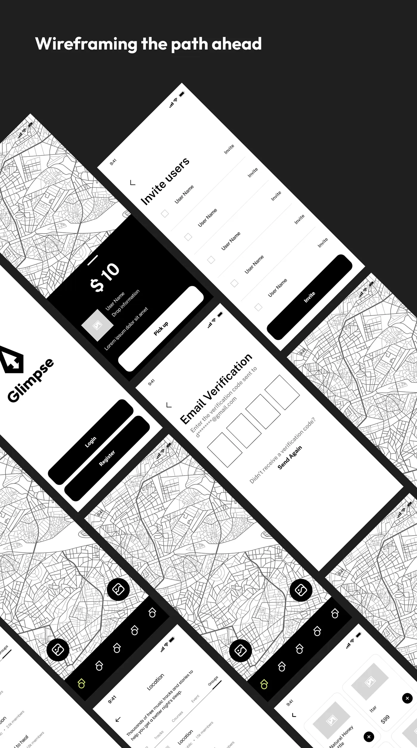
3. Wireframes
The problem. The map had to stay the main surface while still showing who left a drop, its value and how long it lasts.
The solution. Wireframed a full-screen map with a bottom sheet for drop details, plus login, email verification and invite-friends screens for onboarding.
4. Drop mechanics
The problem. Creating and collecting a drop involved many choices, and a mistaken pickup would move real money.
The solution. Create a drop splits into public or private and money or tokens, with a days-available slider, a message and a payment method. Pickup uses a slide control and ends on a clear "You received $25" confirmation.
5. Business admin
The problem. Businesses placing branded drops needed to see what happened to them after launch.
The solution. Designed a web dashboard with a map view, drops list, users table, scoreboard and bank accounts. Businesses can open any drop on the map, view its details or remove it.
6. Testing
The problem. The Drop concept was new, so it was unclear whether people would understand how to find, collect and redeem one.
The solution. Ran usability tests with 8 beta users focused on the clarity of drop mechanics. Feedback covered map navigation, pickup confirmation and ease of redemption, with analytics planned for real-world trials.
What the product does
- Map of nearby drops by type
- Slide to pick up a drop
- Create public or private drops of money or tokens
- Wallet, leaderboard and business admin dashboard
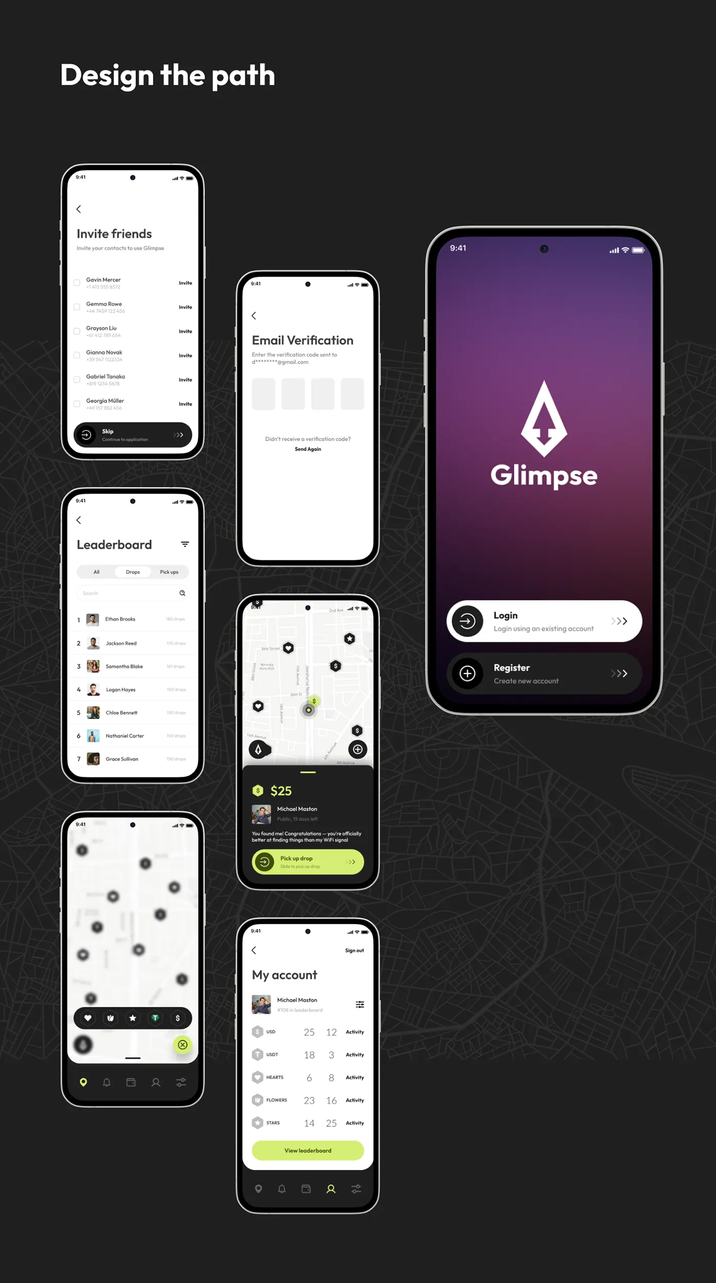
The design system
Light map screens with dark bottom sheets, lime accents, custom icons and feedback animations. The design library on the project page rebuilds the hexagon map pin, drop bottom sheet, drop type picker and token balance row as components with their variants.
The outcome
An interactive prototype of finding, creating and picking up drops was tested with 8 beta users on the drop mechanics, the map and redemption before the final UI.
Glimpse is one of four products, with Orbitra, Sunlight and ThutoTime, behind 20–35% higher retention and up to 50% better conversion.
Questions about this work? Let’s talk it through.
Set a meeting