Designing a mental health app for at-risk teenagers: Sunlight
A mental health support app for teenagers who may be at risk. How the mental health mobile app was designed, phase by phase.
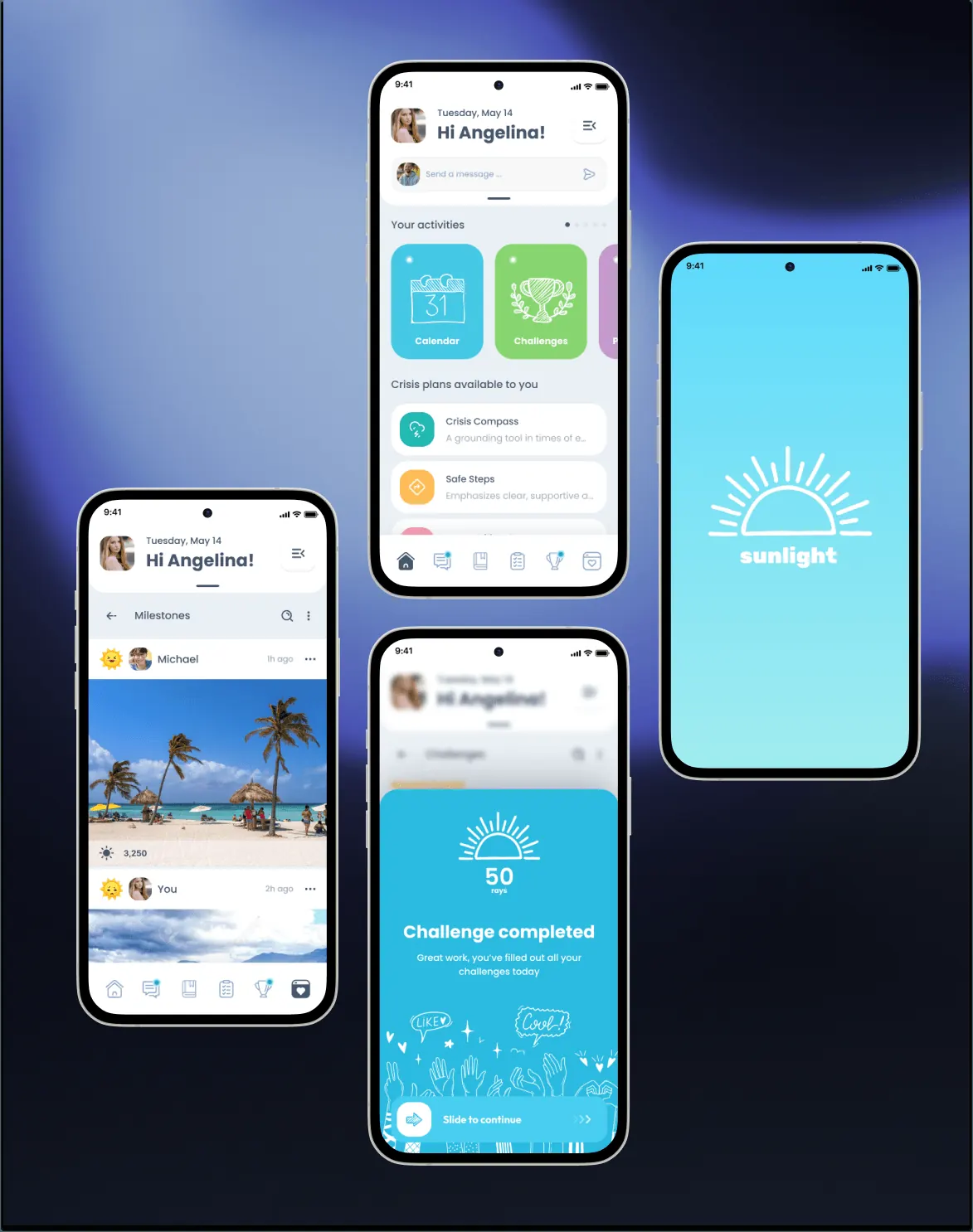
A mental health support app for teenagers who may be at risk.
Project at a glance
- Product: Sunlight, a mental health mobile app
- Platform: Mobile
- Software: Figma
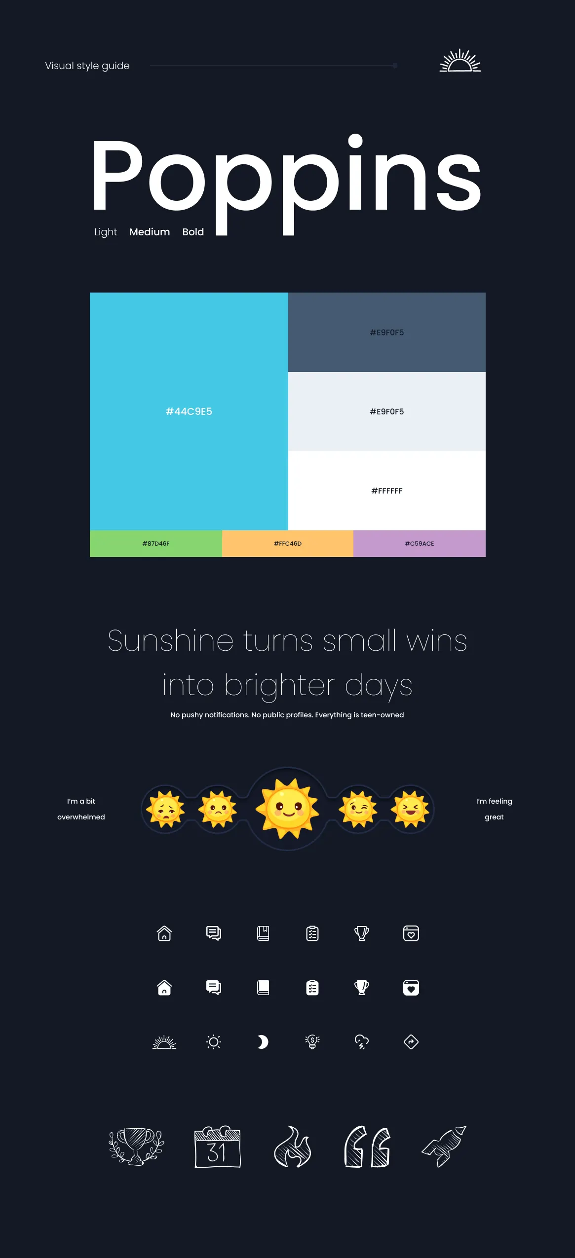
- Design system: Visual style guide: Poppins, a cyan-led palette, sun-emoji mood scale and a custom icon set, in light and dark themes
The challenge
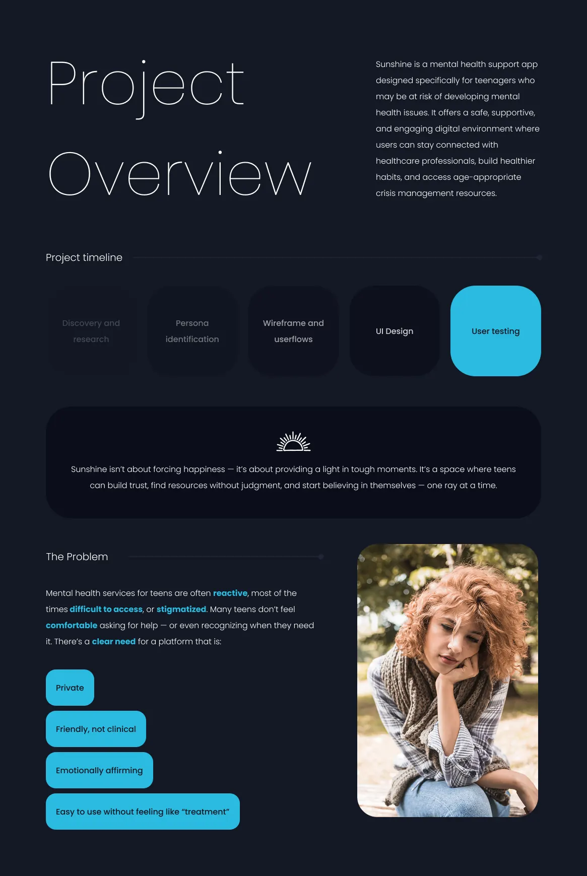
Mental health services for teens are often reactive, hard to access or stigmatised, and many teens don’t feel comfortable asking for help. They needed something private, friendly rather than clinical, and easy to use without feeling like treatment.
The UX approach
The work moved through 6 phases: research, personas, information architecture, daily check-in, rewards and visual system.
1. Research
The problem. Support for teens is often reactive, hard to reach or stigmatised, and many won't ask for help.
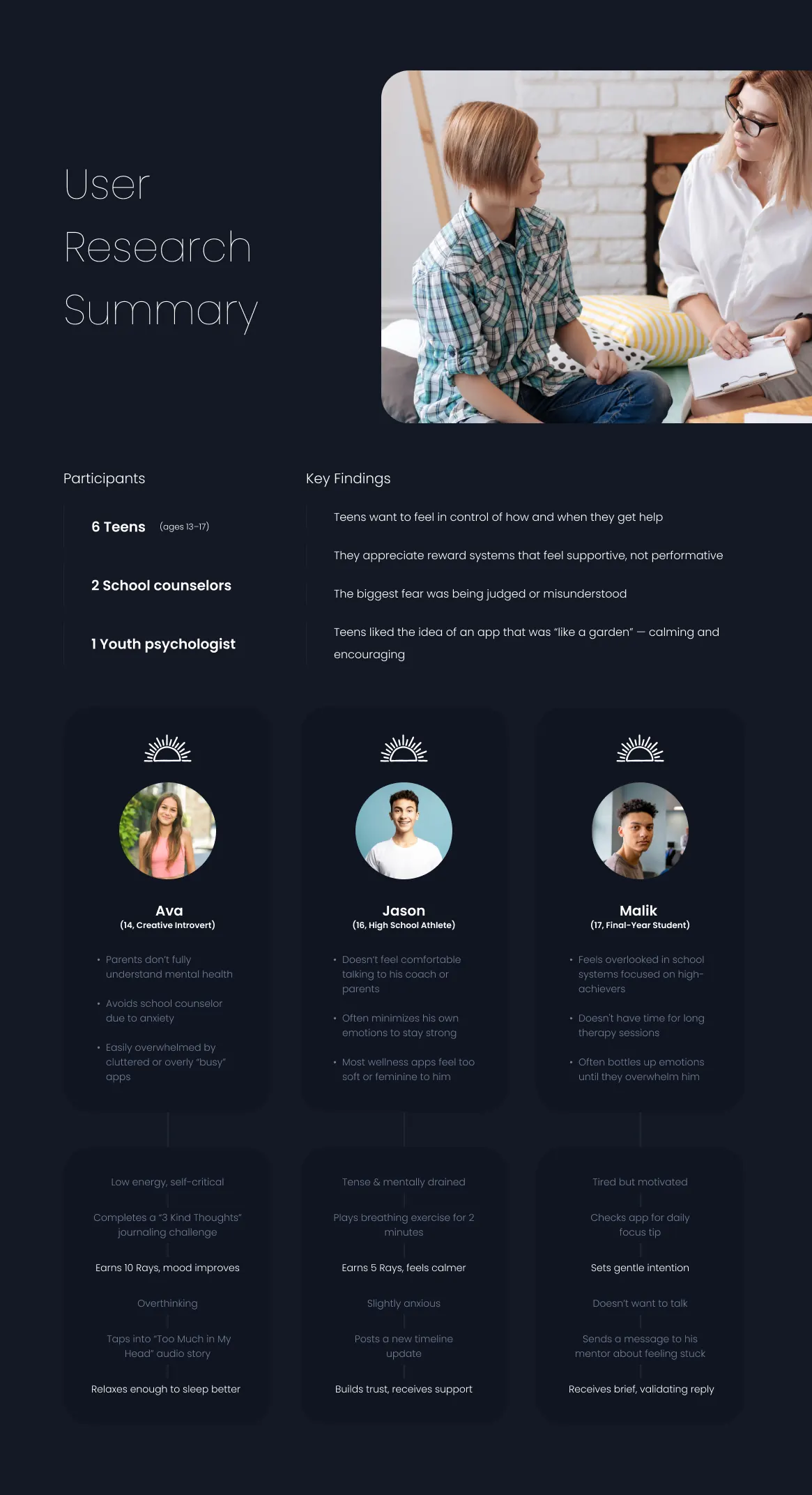
The solution. Spoke with six teens aged 13–17, two school counsellors and a youth psychologist. Teens wanted control over how and when they get help, and feared being judged.
2. Personas
The problem. An anxious introvert, an athlete who hides his feelings and a stretched final-year student need very different things.
The solution. Built three personas, Ava, Jason and Malik. Each has an emotional journey from a low moment to one small action in the app.
3. Information architecture
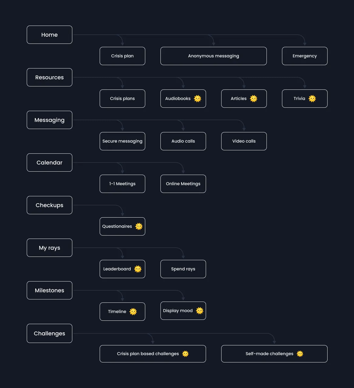
The problem. Crisis tools, messaging, check-ups and rewards had to live together without the app feeling clinical or crowded.
The solution. Organised eight sections, from Home and Resources to My rays and Challenges. Crisis plan, anonymous messaging and emergency sit one step from Home.
4. Daily check-in
The problem. Many teens struggle to put feelings into words, and long forms push them away.
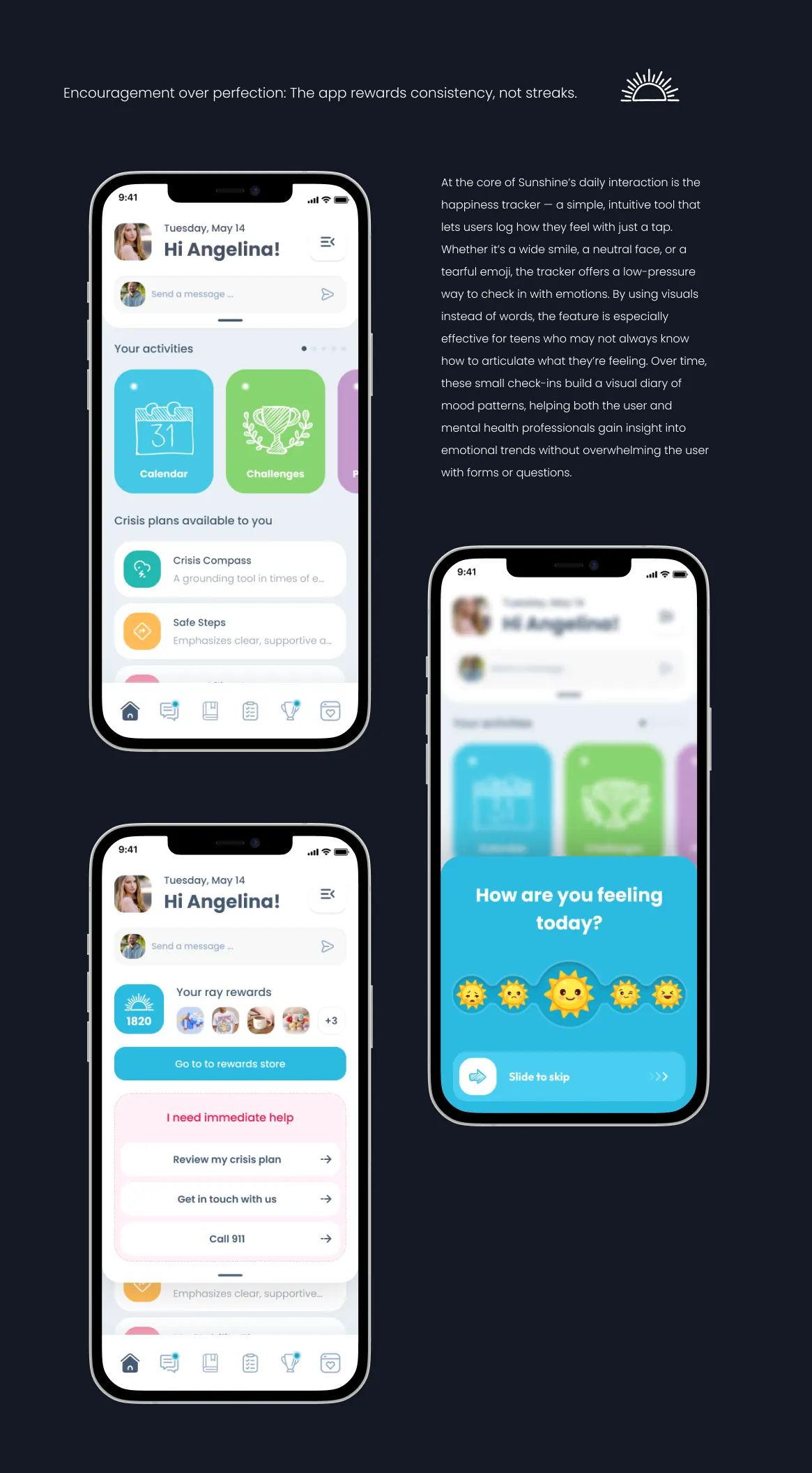
The solution. Made the check-in a one-tap sun-emoji scale with a slide-to-skip option. Crisis plans and an "I need immediate help" panel stay on the home screen.
5. Rewards
The problem. Teens responded to rewards that feel supportive, while streaks can turn into pressure.
The solution. Designed "Rays" that reward consistency over streaks. They are earned through challenges and check-ups and spent in a rewards store.
6. Visual system
The problem. The app had to feel friendly rather than clinical, and not read as too soft for teens like Jason.
The solution. Set Poppins with a cyan-led palette, green, yellow and lilac accents and hand-drawn activity illustrations, in light and dark themes.
What the product does
- One-tap mood tracker
- Crisis plans and an “I need immediate help” panel
- Secure messaging and calls with professionals
- Challenges, check-ups and “Rays” rewards
The design system
Visual style guide: Poppins, a cyan-led palette, sun-emoji mood scale and a custom icon set, in light and dark themes. The design library on the project page rebuilds the sun mood scale, immediate help panel, ray rewards balance and challenge progress card as components with their variants.
The outcome
Research with 6 teens aged 13–17, 2 school counsellors and a youth psychologist shaped an interactive prototype of the mood tracker, the crisis plan and secure messaging, with a full visual system in light and dark themes.
Sunlight is one of four products, with Glimpse, Orbitra and ThutoTime, behind 20–35% higher retention and up to 50% better conversion.
Questions about this work? Let’s talk it through.
Set a meeting